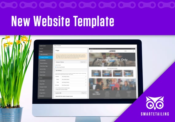
Meet Inigo, SmartEtailing's Newest Template
 Clean and modern without sacrificing usability - that was our objective when we designed Inigo, the seventh responsive template available for all SmartEtailing retailers.
Since we’ve rolled out our responsive template environment, ecommerce trends have continued to evolve. While many of the basic principles remain the same - always put the user first, design for all screen sizes, be informative but concise - user behavior has adapted to an ever changing online and retail environment.
Now more than ever, it’s critical to have a website that meets your visitors’ expectations and guides them quickly and efficiently to the goods and services that they want. With a distraction-free header layout, Inigo can help you accomplish this goal.
Learn more about Inigo’s features, and explore all of our new responsive template options in the Template Publisher within your Site Manager.
Inigo's Standout Features
Hamburger Menu
To allow you to achieve a minimalist look, Inigo’s navigation is displayed as a hamburger icon, or stack of three horizontal lines, in the right corner of the header.
With a single click, the menu opens to reveal the top level navigation of your site. Users can then drill down into their chosen category, such as catalog or service content, just as they would on a tablet or mobile device.
If you want to remove the clutter of a horizontal navigation bar while still providing an intuitive way for shoppers to refine their site search through a condensed menu, Inigo is an excellent option to meet your design needs.

Mobile Shopping Icons
All SmartEtailing templates feature a store locator, account, and cart icon in the header, typically next to the search function. On Inigo, we’ve ensured that these useful links are visible at the top of the header on all breakpoints, including tablet and mobile displays, to allow shoppers to find you or to complete their purchase in as few clicks as possible.
Once a shopper has placed an item in the cart, a numerical indicator is displayed within the cart icon as a gentle reminder that the item or items are waiting for them as soon as they’re ready to checkout.
Prominent Branding
With the hamburger menu and a clean search bar on opposite sides of the header, Inigo allows you to highlight your brand, front and center, with minimal clutter and distraction.
The default header background color is white, which lets your logo and brand colors pop. While Inigo isn’t intended to be a flashy template, it creates an immediate, positive brand impression that is imperative as new or returning customers visit your website and begin their search for cycling gear or services.
Get Started With Inigo
Inigo is now available in the SmartEtailing Template Publisher. Like our other templates, configuring Inigo to include your logo and brand colors is easy using our Theme Editor. Get started by following instructions in our Help Center article, watching this video to learn more, or contacting us with any questions.
You May Also Like
These Related Stories
.jpg)
Meet Lola, SmartEtailing's Newest Template

SmartEtailing's Commitment to SEO

.png?width=1676&height=300&name=WS_Logo_full_blue%20(1).png)
Comments (2)