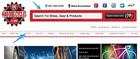
No matter how you attempt to reach your market, it helps to know your audience. How do they consume information? How do they search? How do they browse and shop? If you think about it, you’re probably considering similar factors as you merchandise and manage your physical location. The way you arrange end caps, displays, check out and service are all meant to enhance how your customers see your store in hopes of increasing sales. Consider similar thinking when creating and managing your electronic presence too. For instance, once someone arrives on your website, will they be able to find useful information in the way they expect to find it? It seems there are two main types of website visitors: searchers and navigators.
When searchers land on your home page, they visually scan the site looking for a search field in which to type a keyword or two that will locate the information they are interested in. It’s not that searchers never notice anything else on your home page but it isn’t the primary way they find what they are looking for so it pays to have a very obvious search function and it also pays to place it close to key branding elements (logo, store location, cart) on your site to increase the probability that they notice it as part of their searcher behavior.

By contrast, navigators rarely type anything into a search field. When a navigator lands on your home page, their eyes scan the area above the fold to find words or images related to the information they are interested in. For these visitors, well organized banners, thoughtful site navigation and intriguing images are the keys to drawing them in and ensuring they make it past your home page. If you successfully guide the navigator into your product catalog, rich filtering options can be one of the most effective closing tools on your site. Much like their behavior on the home page, when a navigator is presented with a list of products, they typically scan the results for buttons, boxes or options to distill that list down to where their specific interests lie. So when they land on a page full of road bikes, it is important that the navigator can easily filter by brand, style, size and gender.
Fortunately, what’s good for the searcher is good for the navigator and vice versa. Paying attention to page titles, product names, category structures and intuitive top level navigation make searches more efficient while pleasing the navigators among your customers too. Interestingly, efforts to make searchers and navigators comfortable on your site also makes your site more attractive to search engines and that’s what gets the balling rolling in the first place.
by Mark Still, SmartEtailing Client Services
No Comments Yet
Let us know what you think