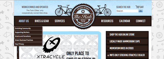
When customers visit your bike shop website, you want it to expertly direct them to the right services and products, the same way you do in person in your store. You do this with smart top-level navigation on every page on your website. Here are some great basic tips to help optimize your navigation and your customers' online shopping experience.
Top-level navigation should reflect the store's competitive advantage and other elements that are important to the store's brand. If the service department is a big part of what the store is all about, make sure to feature it in top-level navigation. In most cases, your products should be a major part of top-level navigation, which means you need to provide clear links to the catalog.
But, this does not mean providing links to a landing page(s) with only the logos of the brands you carry or even worse those brands' websites. Because, just like consumers come into your physical store to see merchandise, they go to your websites expecting to see specific products and inventory information.
- Provide links to product information and other core services in top-level navigation.
- Make it easy to find basic store information such as location, phone number and hours.
- Think about navigation for mobile devices, tablets and a number of different screen sizes. You may have to customize some mobile pages for your site.
- Make sure links are functional and try to avoid linking away from your website.

This store has well thought out top-level navigation. Notice how the main categories used in the banner line up with what’s key to making the in-store experience successful.
Have Good CTA (Calls To Action)
For key elements you want to feature, use CTA’s. In other words, use design to get people to go where you want them to go. Utilizing bright colors (in moderation) can draw the users' attention to critical areas of the site. Notice how the “Deals” button is bright red, a great example of how strong contrast can drive conversions by tapping into our “lizard brains.”

Read more about CTA’s in this article http://www.copyblogger.com/call-to-action-buttons/
Create Landing Pages
Products, events and other important happenings in the store can be highlighted on the home page in a condensed form with links to landing pages with more information. Creating landing pages with relevant locally focused keywords for major product categories can help with SEO as well as make the site easier to shop. Think of it as online version of creating a road bike section in your store where products that fit into this category can be merchandised together.
Use a Footer
Footers provide a secondary way for visitors to find what they are looking for on the site. Footers also are a good way to provide links to pages on the site that may not be important enough to feature in top-level navigation.
No Comments Yet
Let us know what you think